How to Increase Website Conversion through Proper Integration of Deposits and Withdrawals
08/08/2025

Conversion is what makes a digital business successful, which means that ease of use and simplicity are more important than ever. This is especially true when it comes to key processes like making a deposit or withdrawing funds—particularly in crypto. If these actions are difficult or inconvenient for customers, there's a high chance they will simply leave and never return. The main takeaway: proper integration of payment services is the true foundation for increasing conversion and user trust, not just a formality.
Let’s explore how this works in practice at PassimPay and why it matters.
As we mentioned, the number one factor that lowers conversion rates is friction in the user journey. If forms are confusing or unclear errors appear, customers abandon the process. This means not only lost revenue on those transactions but also potential long-term losses due to a poor user experience. The simpler and clearer the process, the higher the chances that users will complete and successfully finalize their operations.
That’s why one key “feature” is a well-organized interface structure. Imagine a menu on the left side that clearly separates core actions: “Deposit Crypto,” “Deposit Fiat,” “Withdraw Crypto,” “Withdraw Fiat.” This kind of categorization helps users quickly find the function they need without confusion. The active section is always prominently highlighted with color and an icon. It’s straightforward but effective — reducing the risk of selecting the wrong option.
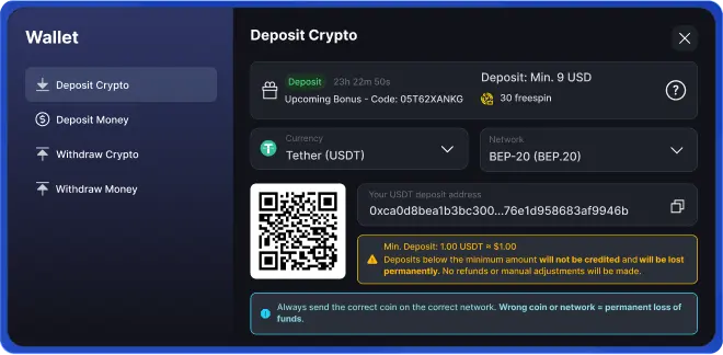
Inside the main window, for example, in the “Deposit Crypto” section,all focus is on one thing: depositing cryptocurrency. The heading clearly states what the user needs to do, a green button prompts confirmation, and next to it, there may be a timer showing bonuses or rewards (e.g., 30 free spins). This is not just a gift but a motivation to complete the process immediately without hesitation.
Moreover, selecting the currency and network must be made simple and clear. This is critical for crypto because mistakes in selecting the network, such as sending USDT via the wrong protocol, can result in permanent loss of funds. Therefore, a dropdown list for choosing the currency and a clear network indication are not just decorative — they protect both users and the business from costly mistakes.


Deposit details are also designed for maximum convenience: there is a QR code for easy scanning via phone, the address is clear and readable but partially hidden for security, and there’s a copy button to avoid typos and accidental transfers to the wrong address. Taking care of these details saves users from unnecessary stress and reduces support requests, thus speeding up transaction processing.

Informational blocks serve as another safeguard against errors. Bright warnings about minimum deposit amounts make it clear that sending less will result in a loss of funds, with a critical message: “Wrong coin or network = permanent loss of funds.” This simple yet clear UX element protects users from costly mistakes while educating them and increasing trust.

In summary, when all these elements are implemented well, we get:
- Instant and hassle-free QR code scanning
- The ability to select only the correct network and currency — fewer errors
- Motivation through bonuses and gamification, encouraging users not to delay
- Quick address copying to avoid confusion and mistakes
- Clear warnings that create a sense of reliability and transparency
What does this lead to? Higher conversion rates—more people successfully complete transactions, fewer users drop out due to confusing interfaces or errors. Customers start trusting the service and return again, while loyal users often recommend your service to others.
If you want, we can help you with the integration or even prepare a detailed checklist with recommendations completely free — just get in touch!
Do you like this article? Share it with your friends.
More